
 11 min read
Note: This article is part of our Backstage guide series. You can find the complete guide here.
Additionally, all articles of the complete Backstage guide are open sourced on GitHub and you can submit pull requests if you think the content needs to be updated. We maintain the information thanks to your feedback.
This is the first article in the “Succeeding with Backstage” series. This series is for those with a working Backstage implementation who want to ensure smooth adoption and ongoing successful use of the tool.
If you’re still trying to decide if Backstage is for you, you can check out the first article in the “Evaluating Backstage” series. If you’ve already decided and are looking to take your first steps into adoption, the first article in the “Implementing Backstage” series is a great place to start.
The iconic green and gray of Backstage’s internal developer portal isn’t for everyone, and the default look certainly might not win over everyone on your team. So, once your Backstage implementation is set up, you might want to change the interface to reflect your purposes and branding. Fortunately, Backstage’s look is completely customizable.
In this tutorial, you’ll dig into the components that make up the Backstage interface. You’ll learn how to change them to your liking, including how to create a custom home page with React components, and modify the color palette for the whole app.
Creating a Home Page
One of the first things you’ll notice when creating a new app is that there is no real “home page” for the app. Users of new apps simply land directly on the catalog page for components:

If you’re familiar with Backstage, you’ll know what to do next. However, it’s important to remember that not every user will be familiar with using plugins or creating new entities. Having a functional home page can significantly enhance the user experience and minimize common questions that might be obvious to you.
To test everything you are about to read here, you first need to have a local Backstage app. To create one, you can follow the instructions in an earlier entry in this series. But, to summarize, you basically need to run the following command:
npx @backstage/create-app@latest
With a running app on your machine, you now need to install the home page plugin. Go to your project root folder and run the following:
yarn add --cwd packages/app @backstage/plugin-home
This installs the plugin, but you’ll have to write a new script to create the actual page. According to the official documentation, you should create a new folder structure inside packages/app/src/components to host the home page script. Create a folder called home and create a file called HomePage.tsx within that folder.
The next step is to modify the App.tsx code to direct the root path to your new page and not the catalog. And, since you are taking the root path for the home page, you’ll also need to create a new icon and a route for the software catalog in the left-side panel of the app. Here’s how to create the new route for the home page:
// packages/app/src/components/home/HomePage.tsx
// ...
// Include these imports
import { HomepageCompositionRoot } from '@backstage/plugin-home';
import { HomePage } from './components/home/HomePage';

// Find where the routes are being generated ~line 80
const routes = (
  <FlatRoutes>
    <Route path="/" element={<HomepageCompositionRoot />}>
      <HomePage />
    </Route>
    <Route path="/catalog" element={<CatalogIndexPage />} />
    <Route
      path="/catalog/:namespace/:kind/:name"
      element={<CatalogEntityPage />}
    >
      {entityPage}
    </Route>
    // ... rest of the code
In this code, you first add imports for the home page plugin to build your landing page. You then import the script you just created. In the routes section, you specify that the root route should lead to your newly created home page.
The next step is to change the left-side panel to include the home page and change the icon used for the catalog. To achieve this, modify the script /packages/app/src/components/Root/Root.tsx to import a new icon for the catalog and change the current sidebar to use the home icon for the home page. Here is the relevant part of the code:
// In the imports ~line 28
import SearchIcon from  '@material-ui/icons/Search';
import CategoryIcon from  '@material-ui/icons/Category';
// ...
// Find export const Root, then modify the sidebar
export const Root = ({ children }: PropsWithChildren<{}>) => (
  <SidebarPage>
    <Sidebar>
      <SidebarLogo />
      <SidebarGroup label="Search" icon={<SearchIcon />} to="/search">
        <SidebarSearchModal />
      </SidebarGroup>
      <SidebarDivider />
      <SidebarGroup label="Menu" icon={<MenuIcon />}>
        {/* Global nav, not org-specific */}
        <SidebarItem icon={HomeIcon} to="/" text="Home" />
        <SidebarItem icon={CategoryIcon} to="catalog" text="Catalog" />
        <SidebarItem icon={ExtensionIcon} to="api-docs" text="APIs" />
        // ... rest of the code
With this code in place, all the setup needed to have a home page is ready. You still need to create the home page, but don’t worry; you’ll tackle that next.
If you have experience creating React components, the next part will feel very familiar. The home page functions just like any other React component. You can include basically any component you want using the app integrator. Let’s explore how this works using one of Backstage’s Storybook examples as the base:
// Base imports to build the home page
import {
  HomePageToolkit,
  HomePageCompanyLogo,
  HomePageStarredEntities,
  TemplateBackstageLogo,
  TemplateBackstageLogoIcon,
} from '@backstage/plugin-home';
import { Content, Page, InfoCard } from '@backstage/core-components';
import { Grid, makeStyles } from '@material-ui/core';
import React from 'react';
import { SearchContextProvider } from '@backstage/plugin-search-react';
import { HomePageSearchBar } from '@backstage/plugin-search';
import { Warning } from '@material-ui/icons';

// Styles
const useStyles = makeStyles(theme => ({
  searchBarInput: {
    maxWidth: '60vw',
    margin: 'auto',
    backgroundColor: theme.palette.background.paper,
    borderRadius: '50px',
    boxShadow: theme.shadows[1],
  },
  searchBarOutline: {
    borderStyle: 'none',
  },
}));

const useLogoStyles = makeStyles(theme => ({
  container: {
    margin: theme.spacing(5, 0),
  },
  svg: {
    width: 'auto',
    height: 100,
  },
  path: {
    fill: '#7df3e1',
  },
}));

const useBannerStyles = makeStyles(theme => ({
  container: {
    backgroundColor: theme.palette.warning.light,
    color: theme.palette.warning.contrastText,
    padding: theme.spacing(2),
    display: 'flex',
    alignItems: 'center',
    justifyContent: 'center',
    borderRadius: 5,
    marginTop: theme.spacing(3),
  },
  icon: {
    marginRight: theme.spacing(1),
  },
}));

// Banner
const WarningBanner: React.FC = () => {
  const classes = useBannerStyles();
  return (
    <div className={classes.container}>
      <Warning className={classes.icon} />
      This is an example of a warning banner, you can give general advice here
    </div>
  );
};

export const HomePage = () => {
  const classes = useStyles();
  const { svg, path, container } = useLogoStyles();

  // Direct links to useful locations, which you can change to whatever you want
  const tools = [
    {
      url: '/create/actions',
      label: 'Create/Actions',
      icon: <TemplateBackstageLogoIcon />,
    },
    {
      url: '/docs',
      label: 'Docs',
      icon: <TemplateBackstageLogoIcon />,
    },
    {
      url: '/catalog?filters%5Bkind%5D=user',
      label: 'User Catalog',
      icon: <TemplateBackstageLogoIcon />,
    },
    {
      url: '/catalog?filters%5Bkind%5D=group',
      label: 'Group Catalog',
      icon: <TemplateBackstageLogoIcon />,
    },
  ];

  // Use the search bar and starred entities as is
  return (
    <SearchContextProvider>
      <Page themeId="home">
        <Content>
          <Grid container justifyContent="center" spacing={6}>
            <HomePageCompanyLogo
              className={container}
              logo={<TemplateBackstageLogo classes={{ svg, path }} />}
            />
            <Grid container item xs={12} justifyContent="center">
              <HomePageSearchBar
                InputProps={{
                  classes: { root: classes.searchBarInput, notchedOutline: classes.searchBarOutline },
                }}
                placeholder="Search"
              />
            </Grid>
            <Grid container item xs={12}>
              <Grid item xs={12} md={6}>
                <HomePageStarredEntities />
              </Grid>
              <Grid item xs={12} md={6}>
                <HomePageToolkit tools={tools} />
              </Grid>
              <Grid item xs={12}>
                <WarningBanner />
              </Grid>
            </Grid>
          </Grid>
        </Content>
      </Page>
    </SearchContextProvider>
  );
};
This code will create a simple, functional home page:
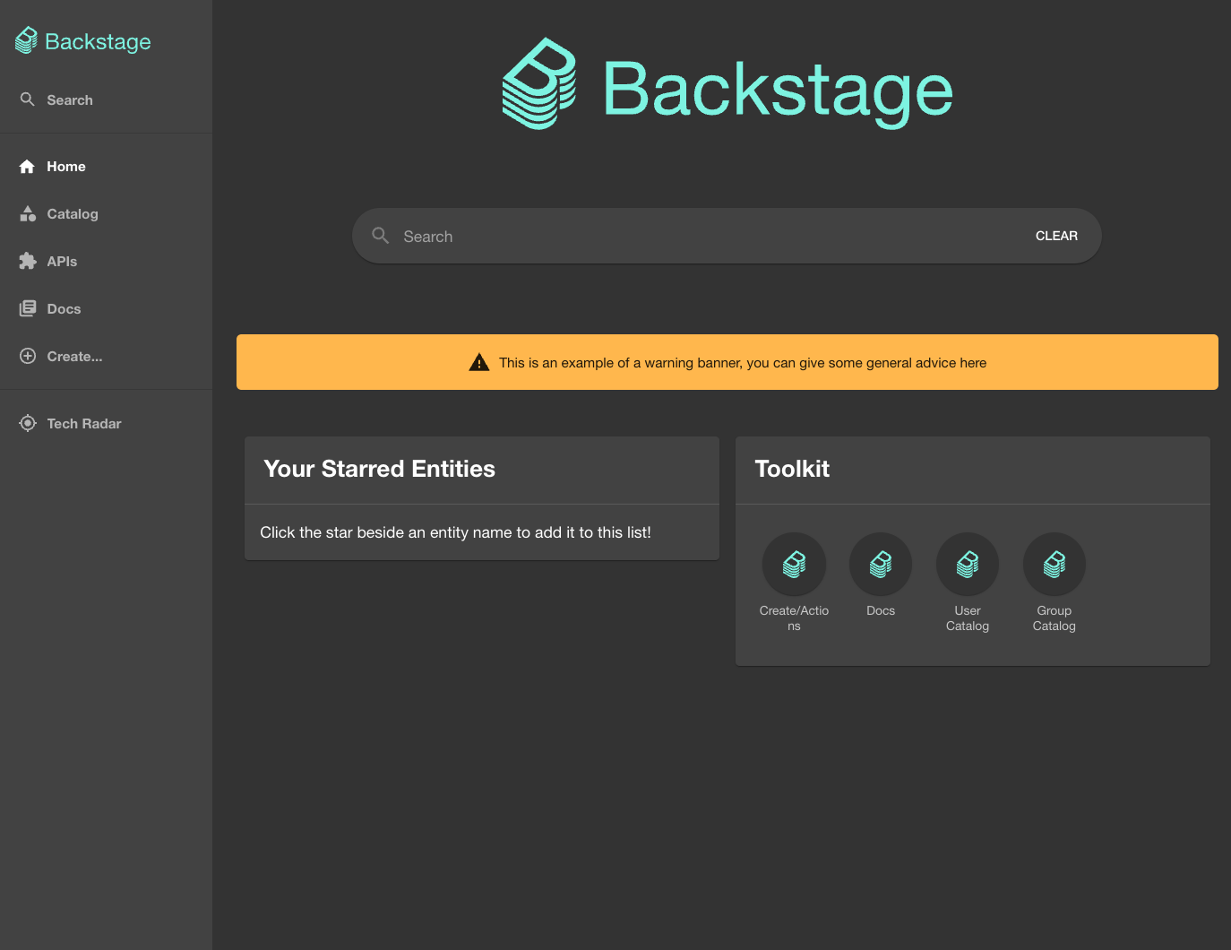
Take a moment to explore the page that’s rendered. Each component provides quick access to valuable resources for the user. When you design your own home page, think about what could be useful for a user to have at hand. You can also find some inspiration by looking at the Backstage Storybook. Be careful not to overdo it. A messy home page will negatively affect the user experience, so you should only include elements that are useful for your typical user.
Your home page can also influence how your users interact with it. As the first thing your users see, your home page has the strongest chance to capture their full attention. If you want them to try out the software templates, put them up front and draw attention to that section using a larger font size or bold colors. Alternatively, if you want to encourage them to use a specific plugin, make sure it stays at the top. You can change the order in the left-side panel and create the card in a different color. Your home page is your best chance to nudge your users in certain directions.
See any information that you think should be updated? Our Backstage guide is open sourced on Github. You can fork it and submit pull requests to keep the article up to date!
Backstage repoChanging the App’s Theme
Regardless of how you feel about Backstage’s default light and dark themes, customizing the app to reflect your organization’s identity will help your users feel at home. You’ll need to add new themes to your app to do that.
Backstage uses Material UI to create themes. Backstage recently updated from Material UI v4 to v5, but the documentation is still outdated in some parts. Be aware that the previous export BackstageTheme has been deprecated in MUI v5. Instead, you’ll need to use themes.light or themes.dark, depending on what you need. These are available in @backstage/theme. Both of these will be used in the next code snippet.
The following code renders the existing light and dark themes and a new theme that you’ll create in the next step in packages/app/src/App.tsx:
// Add imports for the default themes
import { themes } from '@backstage/theme';
// Import to be able to build new themes
import {
  UnifiedThemeProvider
} from '@backstage/theme';
import LightIcon from  '@material-ui/icons/WbSunny';

const app = createApp({
  // ... APIs, plugins, components, etc.
  themes: [
    // Keeping the original themes is completely optional
    {
      id: 'default-dark',
      title: 'Default Dark',
      variant: 'dark',
      Provider: ({ children }) => <UnifiedThemeProvider theme={themes.dark} children={children} />,
    },
    {
      id: 'default-light',
      title: 'Default Light',
      variant: 'light',
      Provider: ({ children }) => <UnifiedThemeProvider theme={themes.light} children={children} />,
    },
    {
    id: 'multicolor-theme',
    title: 'Multicolor Theme',
    variant: 'light',
    icon: <LightIcon />,
    Provider: ({ children }) => <UnifiedThemeProvider theme={multicolorTheme} children={children} />,
    }
  ]
})
This will render the default light and dark themes and a new theme called multicolorTheme.
Note: At the time of writing, the Backstage documentation still reflects the MUI v4 method for creating the default themes. However, you must use MUI v5, as the MUI v4 methods are deprecated.
The above code won’t work until you create your new theme. The following code creates a theme using MUI v5 by taking the default light theme’s configuration and changing some specific parameters:
import {
  UnifiedThemeProvider,
  createUnifiedTheme,
  palettes
} from '@backstage/theme';

export const multicolorTheme = createUnifiedTheme({
  palette: {
    ...palettes.light,  // Take everything from the default light theme, then change what you want
    primary: {
      main: '#FB4341', // Red
    },
    secondary: {
      main: '#D62020', // Darker red
    },
    background: {
      default: '#FFEBEE', // Light red
    },
    navigation: {
      background: '#de8c94', // Lighter red background for the left-side panel
      indicator: '#FB4341', // Red color for the selected indicator
      selectedColor: '#FFFFFF', // White text color for the selected item
      color: '#D2D5D7', // Light gray text color for unselected items
      navItem: {
        hoverBackground: '#D62020', // Darker red for the hover background
      },
    },
  },
  components: {
    MuiButton: {
      styleOverrides: {
        root: {
          textTransform: 'none', // Remove uppercase text
        },
        containedPrimary: {
          backgroundColor: '#001952',
          '&:hover': {
            backgroundColor: '#D62020', // Slightly darker red on hover
          },
          color: '#FFFFFF',
        },
        containedSecondary: {
          backgroundColor: '#FB4341',
          '&:hover': {
            backgroundColor: '#D62020', // Slightly darker red on hover
          },
          color: '#FFFFFF',
        },
      },
    },

  fontFamily: '"Helvetica Neue", Helvetica, Arial, sans-serif',
  defaultPageTheme: 'home',
});
You can change many more parameters and styles, including typography, cards, buttons, and so on. However, you’ll need to familiarize yourself with the createUnifiedTheme function used in the previous code. This function is responsible for creating themes that can work properly with Backstage. The result of the code in the previous block looks like this:

Now, this UI probably isn’t a masterpiece of modern design, but the exciting part is that it’s your app, and you can decide what works for you. Give yourself the opportunity to play around with the colors and give the app a unique twist. You can also register as many themes as you want and remove the default ones.
Your users can alternate between the themes you make available by going to Settings on the lower left side of the screen and clicking the different themes you registered.
Here’s the Settings page with the custom theme applied:

This is what it will look like if the user switches back to the default theme:

Conclusion
As you can see, experimenting with the look and feel of your app is not complicated. Play around and have fun with the color palette. There are some great resources out there to create awesome color palettes. You now have the necessary knowledge to start creating a more customized app with a home page containing all the useful components you might need and a distinctive look that ties it to your organization. Hopefully, this will encourage more and more people in your organization to try your new developer portal and help you improve Backstage adoption in your organization.
Stay tuned for the next article on building and maintaining custom plugins, one of the most effective ways to make this developer portal truly yours.